A graphic collage involving photos of a black and pink ski jacket mixed with outlined logos

Corr

[OVERVIEW]

Corr is affordable, performance-led ski wear designed for the city-to-summit lifestyle, built for occasional and aspiring skiers. The brand set out to challenge the idea that skiing only belongs to the affluent. The challenge was feeling confident and technical without exclusivity.

[RESULTS]

Drawing on girlhood energy and the memory of a first ski trip with friends, the identity balances a bold wordmark with a playful snowflake submark. The result feels technical yet approachable, breaking away from ski wear's usual exclusivity. A brand world built to feel fun, capable and inclusive.

[SERVICES]

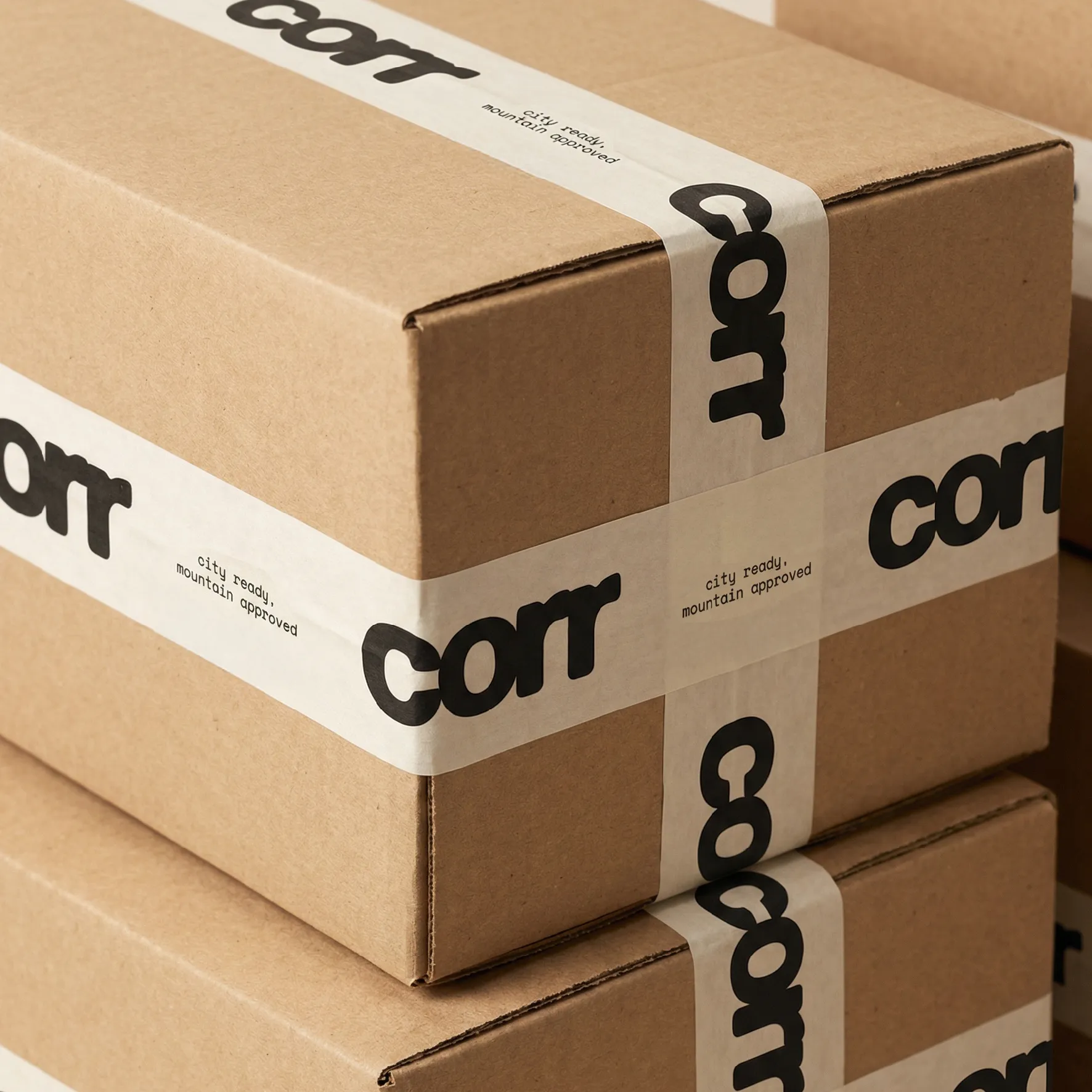
/ PACKAGING

/ LOOKBOOK PDF
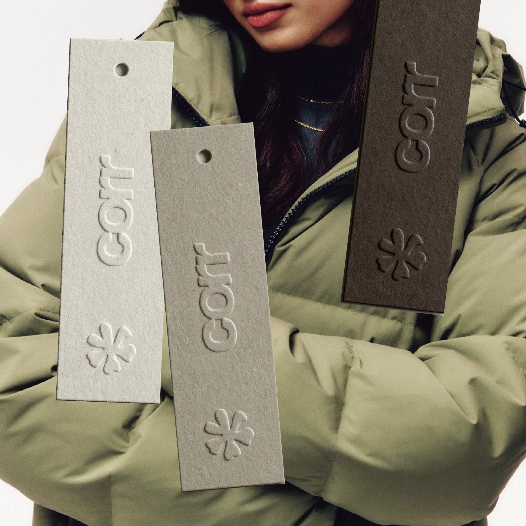
A green ski puffer coat background image with 3 hang tags layered on top.
A light brown background with a dark brown snowflake motif submark on top.
A collection of designs from their lookbook pdf showcasing the ski jacket and trousers.
A brown packaging box with white tape and branded elements involving their wordmark and slogan printed on the tape. The boxes stacked ontop of each other.
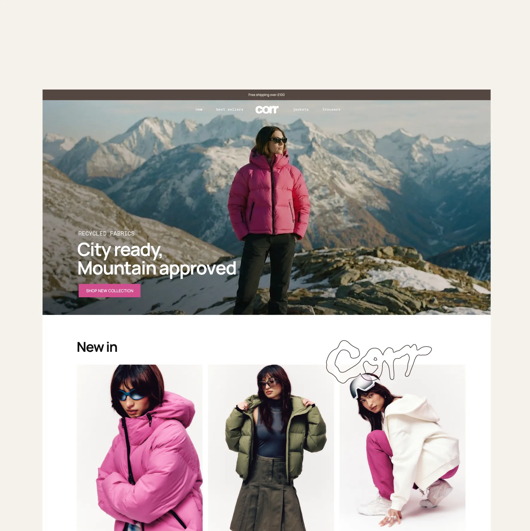
A snapshot of their website homepage
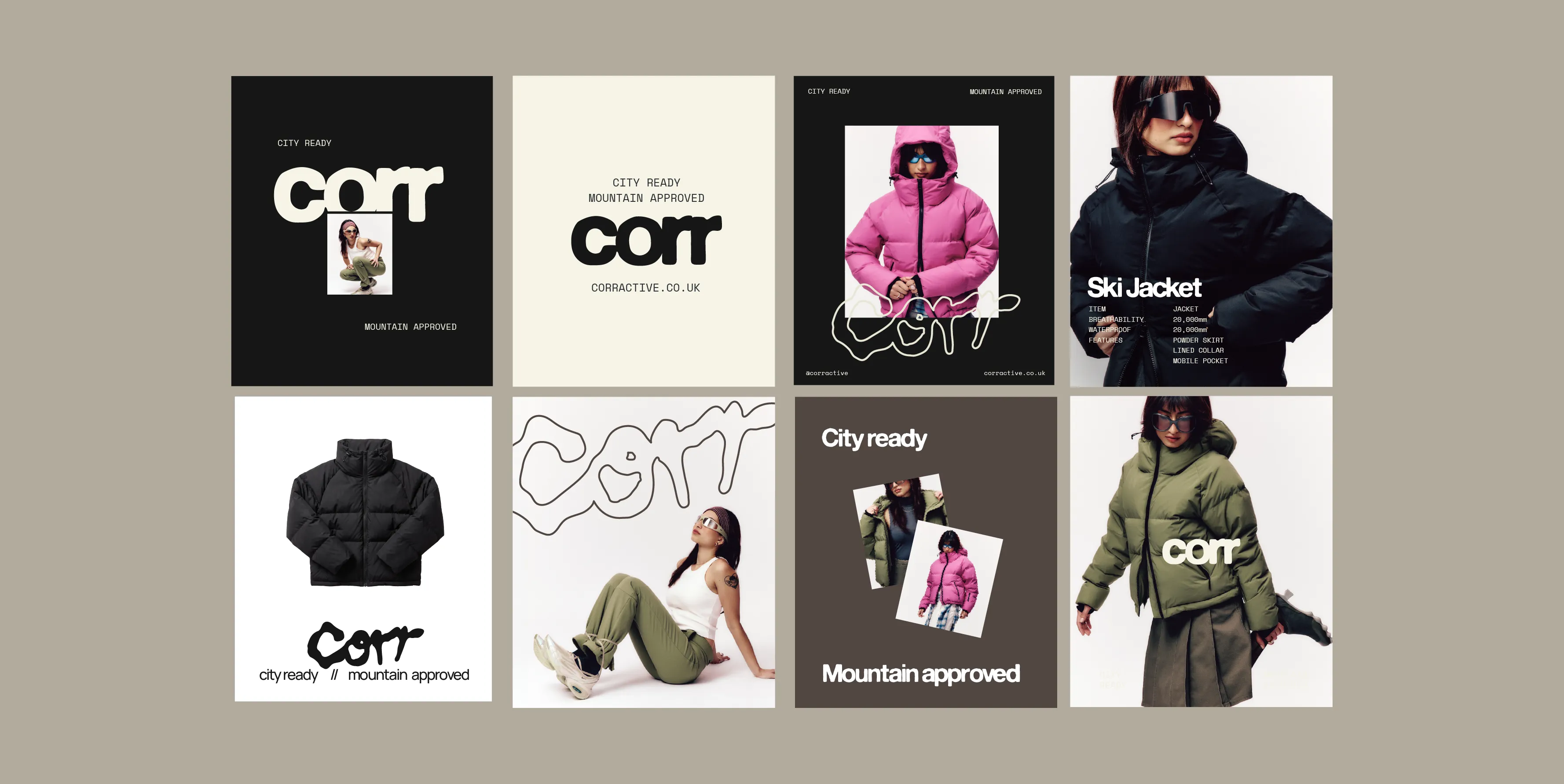
A collection of social media assets promoting the ski brand
Their instagram profile page is overlaid on an image of a model wearing the black puffer jacket.
A brown box with a large square sticker placed on the edge of the box showing their corr logo, slogan, socials and submark printed on.
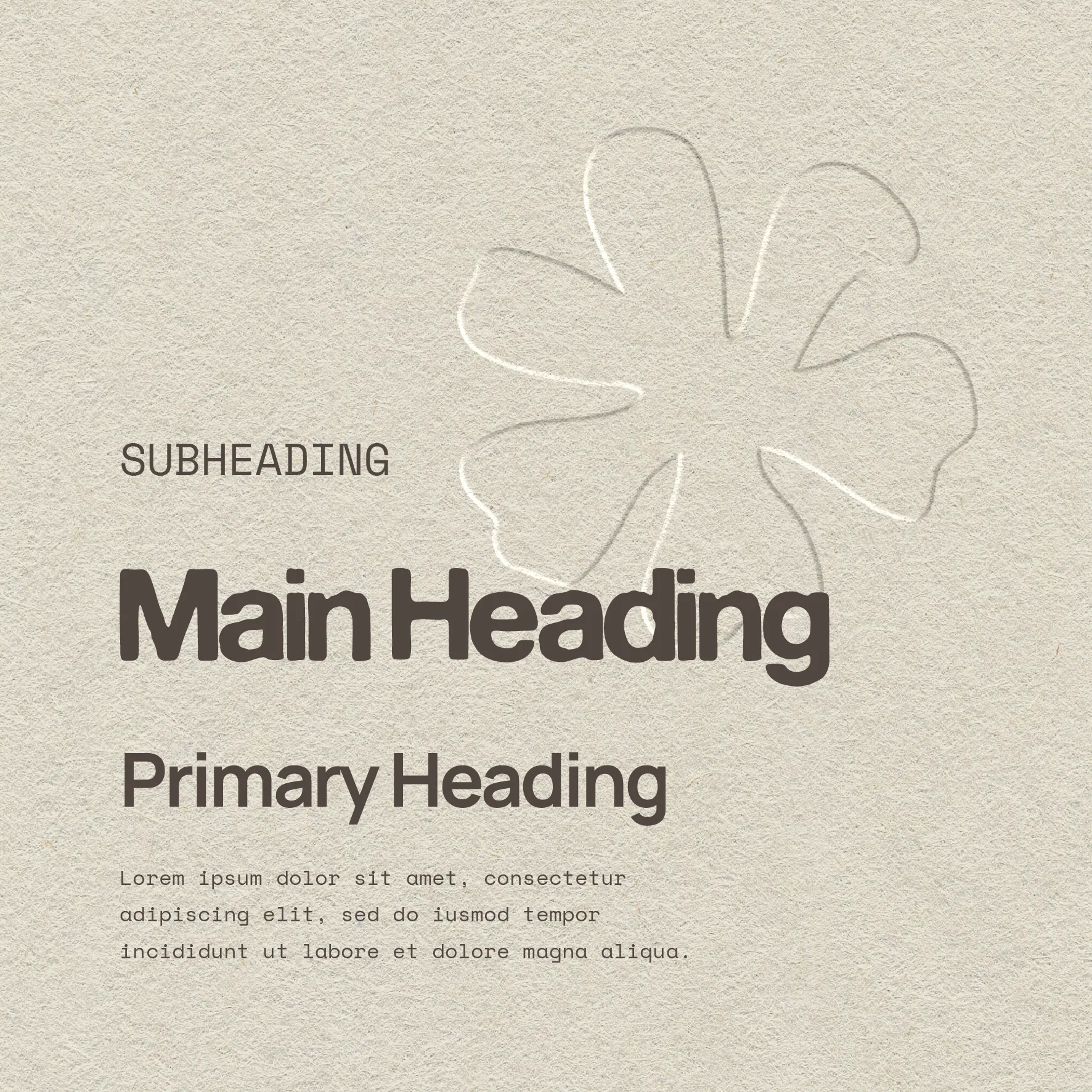
A textured off white background with an embossed snowflake motif as the background, then showcasing their collection of fonts that make up their typography suite shown in correct hierachy.
The inside of a black ski jacket with a big woven label that has the corr logo printed in the middle.

Hotel Pozzillo