
Sommerhouse
[OVERVIEW]
Sommer House is a boutique residential design studio creating homes across the world's most coveted destinations. The identity needed to feel as considered and crafted as the homes the studio designs. The challenge was building a brand world that matched that same level of quality and intention.
[RESULTS]
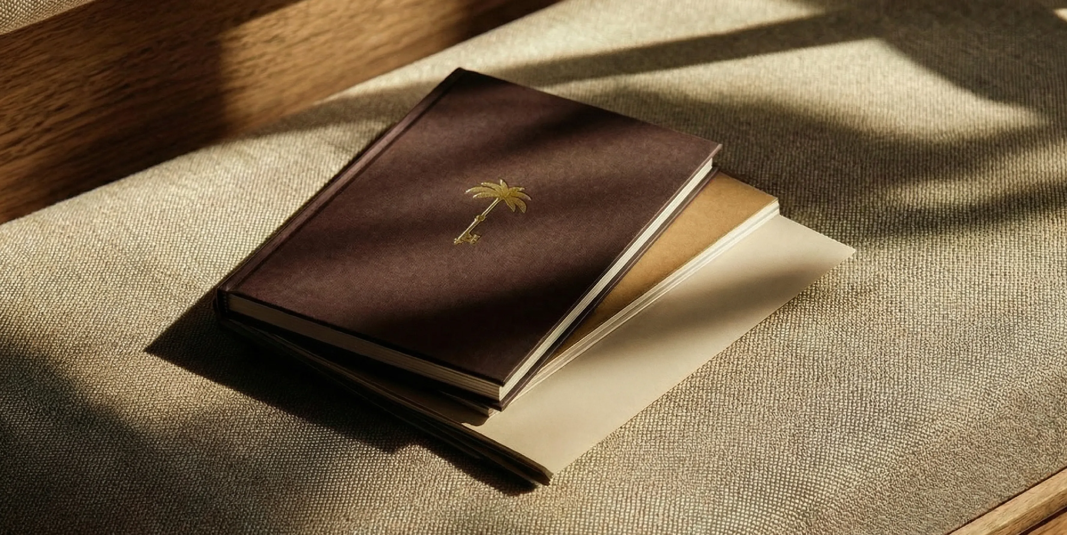
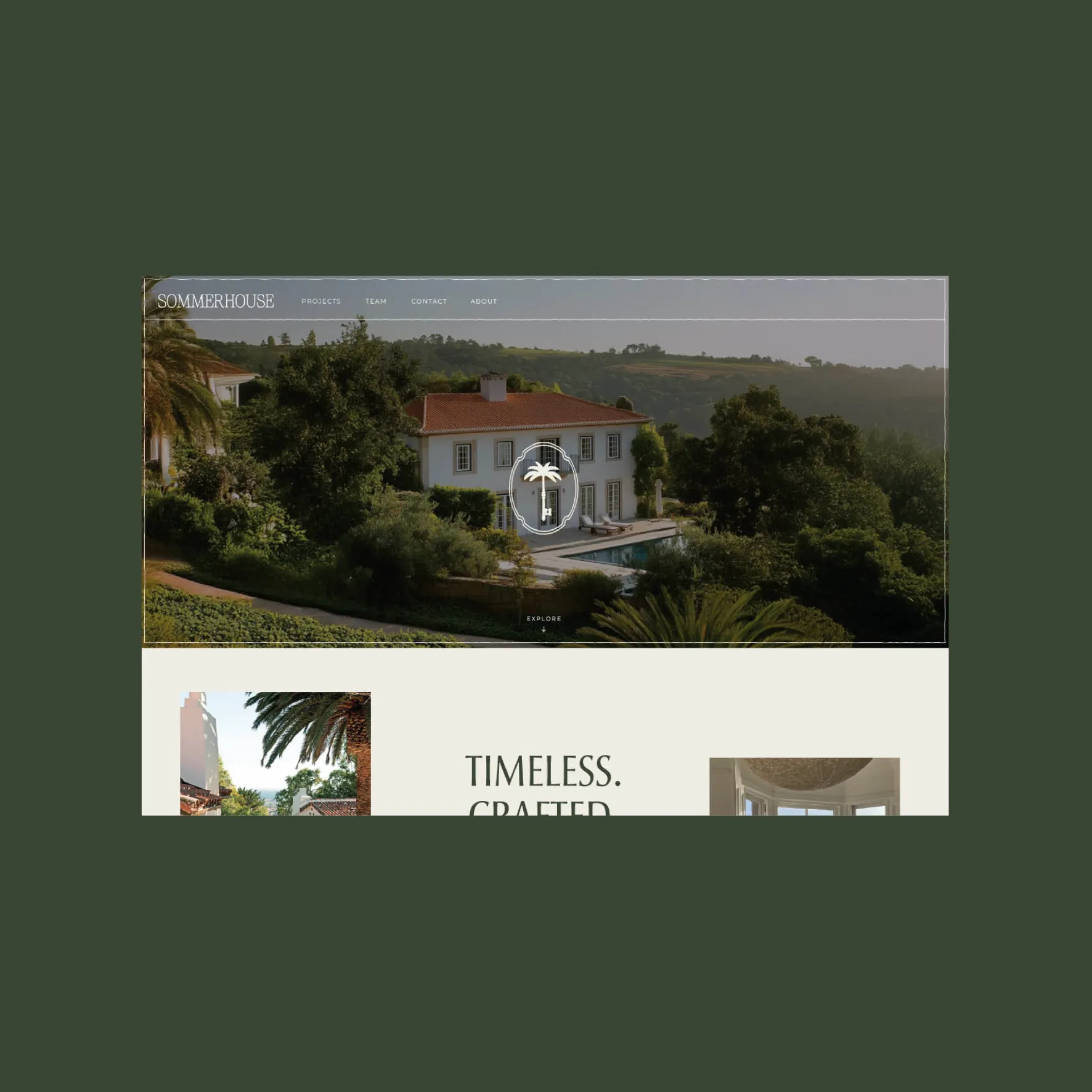
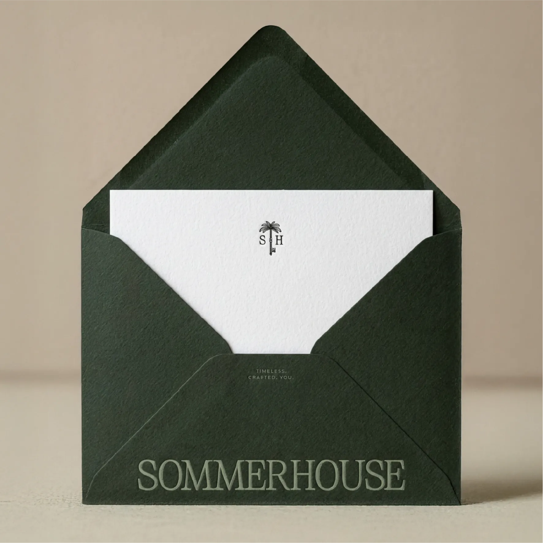
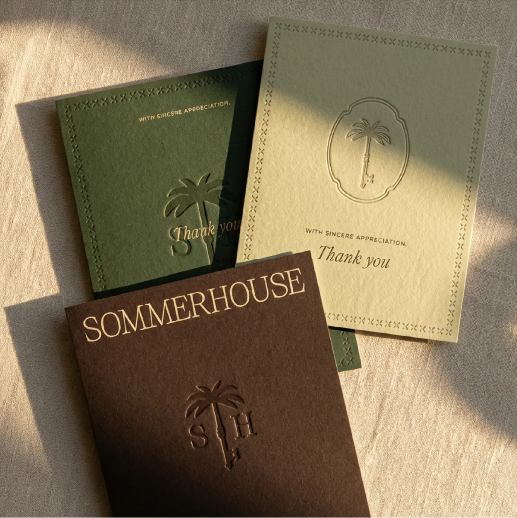
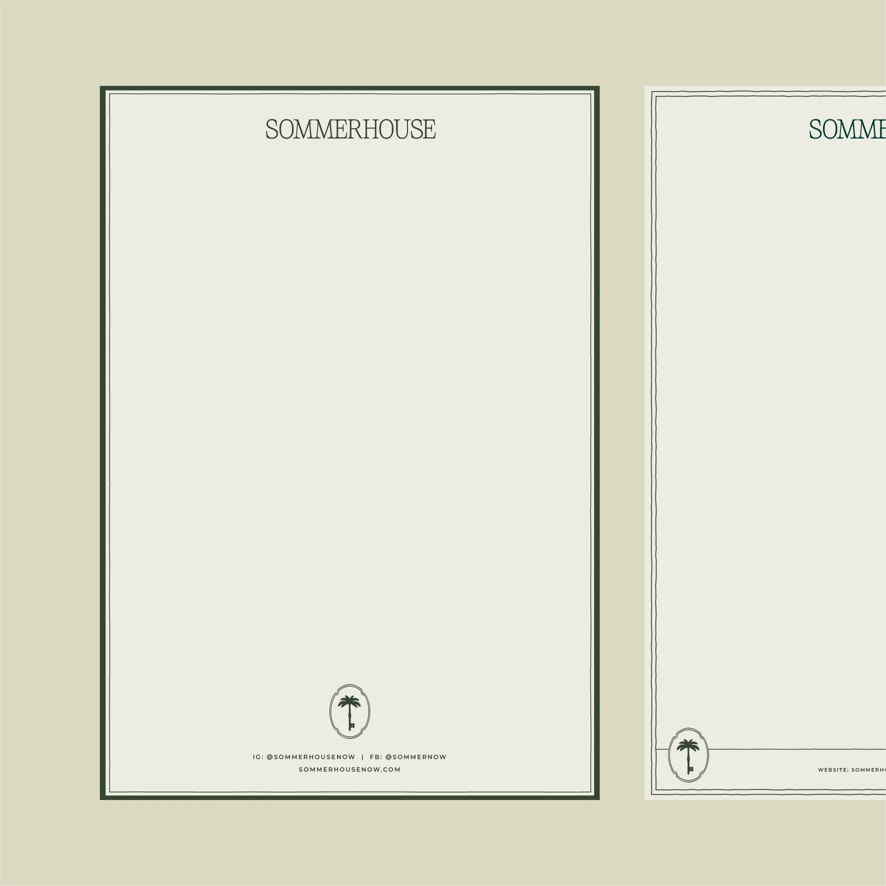
A palm-and-key emblem extended across a full collateral suite. The identity carries the same timeless, crafted feel as the homes themselves. A brand world built to feel as considered as the interiors it represents.
[SERVICES]
/ PRINT COLLATERAL
/ EMAIL TEMPLATES
/ PRESENTATION





[CLIENT TESTIMONIAL]
“We came to Alice with a vision we couldn’t articulate and she translated it into a brand that exceeded what we imagined. The process was seamless. As creatives ourselves, it was eyeopening. More than once we said, ‘This is how we want our clients to feel.’ The final brand is elegant, intelligent, and true to who we are. We’d do it again in a heartbeat. Thank you so much!”